As we know, a graph is a way to visually represent a series of data and by this way to explain the trend of a process as well as of a natural phenomenon. However, in some cases, a graph can be misleading,
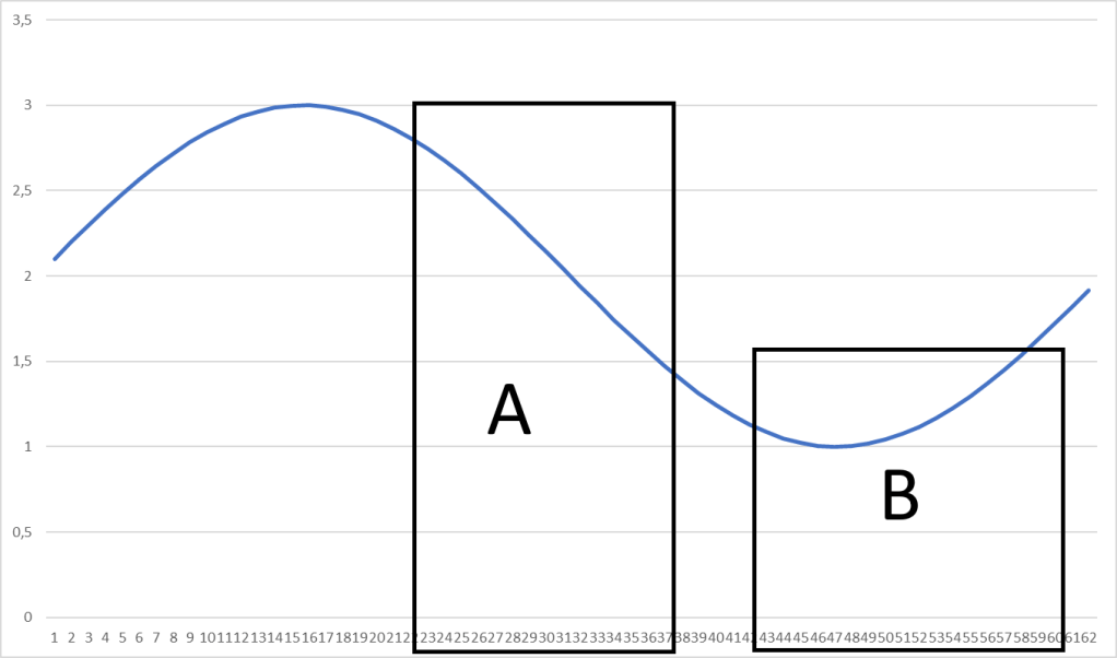
Let’s consider, as an example, the case of a regular periodic phenomenon that, for making it simpler, we represent with a sinusoidal curve as below.

The curve shows a quite regular phenomenon that has a cycle of about 61 periods, let’s say 61 years.
However, we can cut the graph and make wrong conclusions from a portion of it. Those conclusions seem to be deducted from statistic or math and therefore will be credible, while they are not, and sometimes can be fraudulently used.
As an example, we can consider two different selections.

Selection A, from year 23 to year 37, show data that decrease dramatically, we are heading for a catastrophe and maybe is too late for set it right or, in the better hypothesis, energetic measures shall be needed.
On the other side selection B, from year 41 to 60, authorizes a moderate optimism: we have had some problems but apparently we have been able to cope with them are now we are always on the way of growth.
